How a Car is Conceived

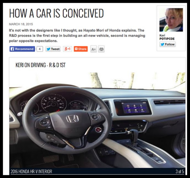
Honda’s all-new HR-V goes on sale soon. During its launch in Miami a few weeks back, I interviewed Hayato Mori, Senior Manager of Product Planning, about how Honda dreamed it up.

I thought the process started with design, throw in a couple features and done – here is a new car that’s never before existed. I was very wrong. Research research research.

Read it online at Autonet.

Favourite line:

By now my eyes are rolling out of my head, “Hayato this is unreasonable! How can something be luxury inside, but for the lowest possible price?!” He just smiles, “that’s the game, Keri.”

Hayato and I.

You’ve met him before, when we talked about the differences between the original Civic and today’s: 1973 – When side mirrors were optional

Above is the presentation slide I’m talking about in the article. I’d have quit after this step, this is a dichotomy!  See last line of column.

Below is the all-new 2016 Honda HR-V.

Blog tag = Honda HR-V

***

Back to ‘Keri on Driving’ – Index


Designing a Strong DRG and Graphic Signature

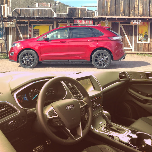
Know how there’s those kind of cars, you see one from a distance, it’s features can’t be made out but you can just tell – it’s a Whatever.

Design Speak: this vehicle has a strong DownRoad Graphic,
its Graphic Signature is solid.

Speaking with Kevin George – Ford’s Exterior Design Manager – we learn about the DRG, and how when confronted with an advancing object, the mind goes through “3 reads”, and how that fits with vehicle design.

Read it online at Autonet.

Favourite line:

Everything described above – this “graphic signature” – is happening during the day, but the designers also have to pull this off at night. 

***

Back to ‘Keri on Driving’ – Index



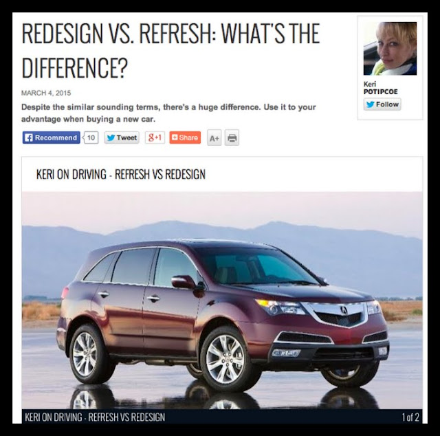
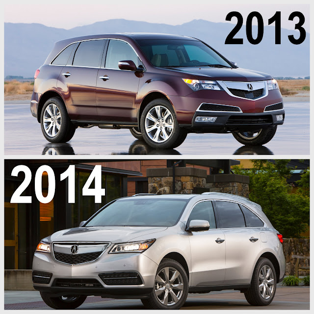
Refresh VS Redesign – What’s the Difference

Sounds similar, but there’s a huge difference:

Refresh = slightly updated from the previous model year
Redesign = all-new from the ground up

How to know which it is? Use the 5-year Test – typically, a vehicle is redesigned once every five years.

Read it online at Autonet.

Use this to your advantage when shopping, because all-new doesn’t mean it’s all-better (see last 3 paragraphs)

Favourite line:

Say to the salesman: Next year the car is being redesigned, so who is going to want this year’s model? It’s about to become outdated, so give me a better price!

Back to ‘Keri on Driving’ – Index


In Design, Millimetres Matter

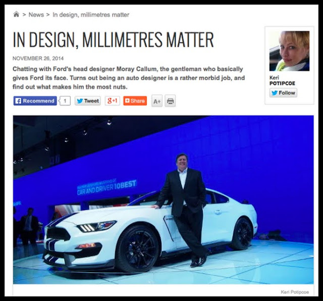
I chatted with Ford & Lincoln’s head designer Moray Callum, the gentleman who basically gives Ford its face.

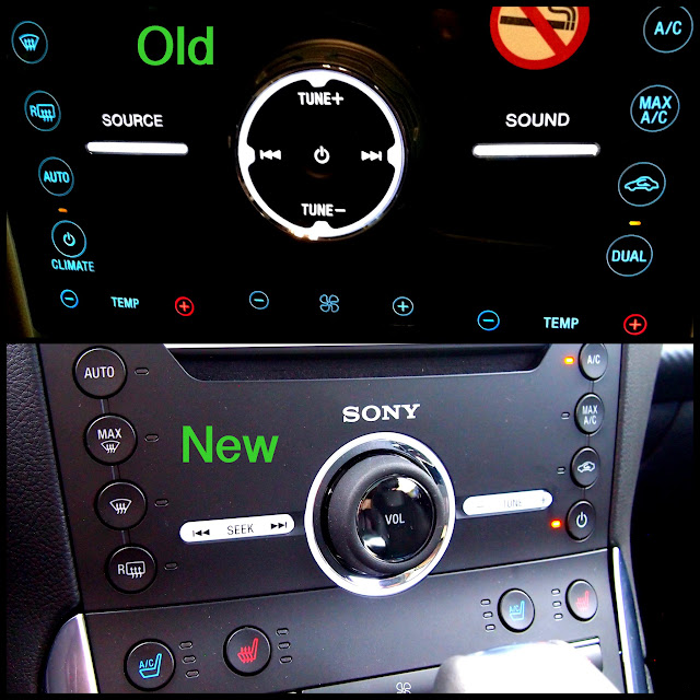
We laughed lots, I say it’s great he’s bringing hard buttons back, turns out being an auto designer is a rather morbid joband I asked what one thing makes him the most nuts.

Read it online at Autonet.

Favourite line:

5th paragraph – Moray’s metaphor on why millimetres matter – imagine altering a face in Photoshop, 8mm here and 6mm there and woah, a totally different face is looking back at you.

Second favourite: 

Moray: You still have to design for the idiot that doesn’t wear a seat belt.

Back to ‘Keri on Driving’ – Index


Why All Bumpers are Starting to Look the Same

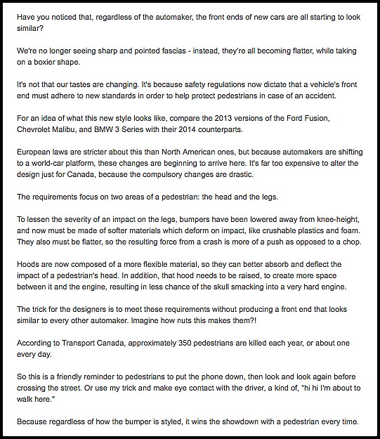
It’s not that our tastes are changing.

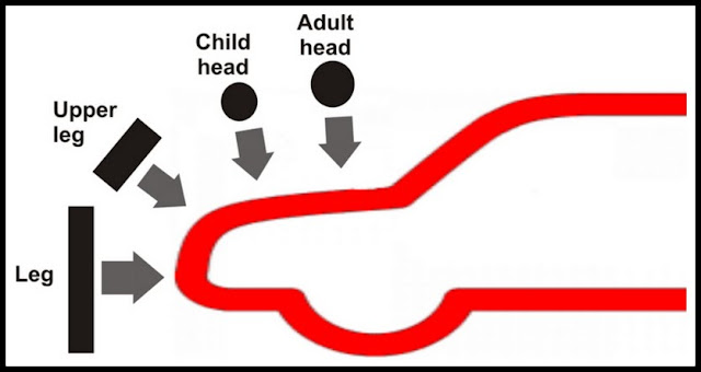
It’s because safety regulations now say a car’s front end must better protect a pedestrian in case of an accident, thereby limiting design and styling possibilities.

Read it online at Autonet.ca

Favourite line:

Put the phone down while crossing the street. Or use my trick and make eye contact with the driver. Because regardless of how the bumper is styled, it wins the showdown every time.

Cars hurt guys.

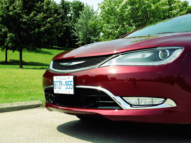
This all-new 2015 Chrysler 200, is a good example of such bumpers.

***

Back to ‘Keri on Driving’ – Index