Good Text Size on an Instrument Cluster

I find the text and icons are too small on many instrument clusters, and poorly placed off to the side.

This cluster’s is large and clear, and placed directly in the centre. Proper.

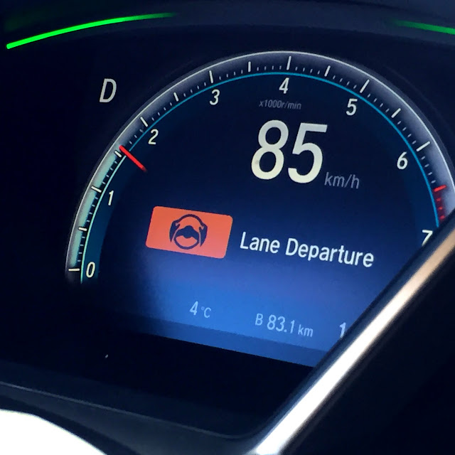
(the above appears when Lane Departure is switched on/off)

This can be read using your peripheral vision,
leaving your eyes where they belong – on the road.

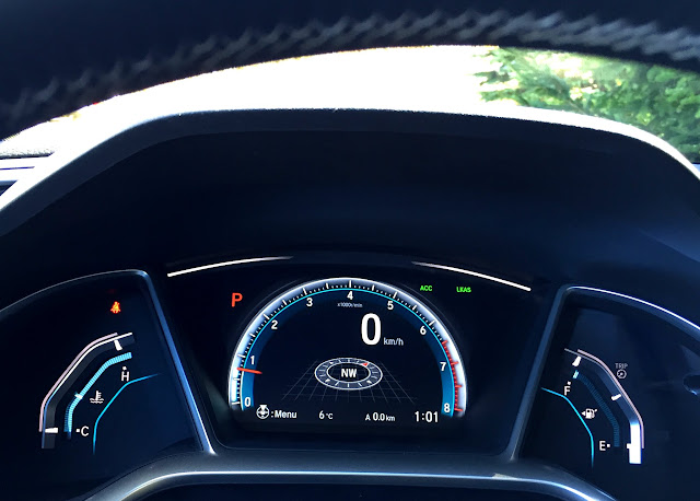
Found on the fully-redesigned 2016 Honda Civic.

Blog tag = instrument cluster


How I Submitted my Taxes

In a premium Honda ad spec ha. Auto for life.

Handed over during my accountant and my annual end-of-year lunch. Every year I say the same thing, “THIS is the year the blog pays off, I just know it.”  And he smiles and says something encouraging, even though every year I’m wrong.

Except this time… after all these years, this one I’m right.

Blog tag = taxes


Trying to Define What Makes a Luxury Vehicle

At what point does a regular vehicle become a luxury one?

It’s tough to pin down! In trying to find one defining element, instead I came up with a bunch of what it’s not –

  • it’s not price,
  • nor number of units sold,
  • it’s not the type of gas it uses,
  • it’s not the number of features it’s equipped with,
  • nor the type of materials it’s finished with.

Plus! People’s benchmark of luxury can vary greatly.. what’s really nice to one may not to another, like – they’re happy with jewelry from People’s, I prefer Piaget.

Read it online at Autonet.

Favourite line:

The only argument that seems to hold is in regards to the one thing that can’t be held or touched – perception. Perhaps that’s it, then – luxury is defined by whoever’s advertising dollars are better at convincing us that something is high-end.

***

Back to ‘Keri on Driving’ – Index