Audi virtual cockpit is a 12.3″ high-res digital instrument cluster that completely replaces the dash screen.
It debuted on the 2016 Audi TT, and is coming next to the 2017 Q7, A4 and R8.
Doesn’t an interior look so much better without a black hole in the dash?
The system is controlled using either the steering wheel controls, or the completely redesigned MMI interface selector wheel.
Instead of 4 function buttons there’s now 2, and the rotary dial acts like a joystick – nudge left, right, like that.
Plus its top is touch-enabled. Use your finger to zoom in or out, or if scrolling a list, write a “K” to narrow in on all results that start with K.
I’ve tested Audi’s virtual cockpit twice.
First was on the active display at the Canadian International Auto Show back in February 2015. I was filming a segment for MotoringTV.
I arrived 10 minutes early before the crew, and in that time, learned the entire system.
That’s not to say I’m a wizard with electronic interfaces, but that the system is intuitive.

It encompasses my favourite type of design – functional and fashionable.
Because dipping your eyes from the road, to the instrument cluster, is a much shorter distance than to a dash screen.
How good does navigation look eh.
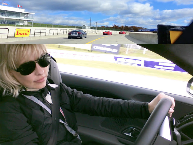
The second test was while driving the all-new 2017 Audi R8 at Mosport.
It wasn’t the best test though.
My saucer-eyes were glued to the track, can only confirm the speedometer is bright and visible.
I predict this setup will be copied by other automakers.
It’s logical, safer, and makes for a more aesthetically-pleasing interior. Plus there’s probably production cost savings by installing just one screen instead of two.
Blog tag = 2017 Audi R8
