As you probably know, Google recently implemented a new rule that penalizes websites that are not optimized for mobile (for more info, read Casie’s post here.)
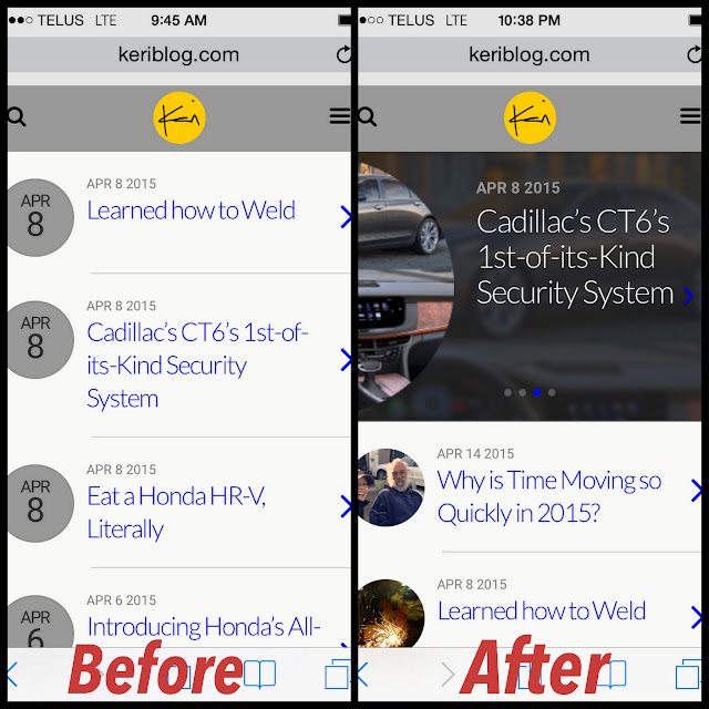
It wasn’t that I missed the deadline, I was early actually. It’s that on your phone, KeriBlog.com now looks like this.
From a colourful fun land to bland grey box time.
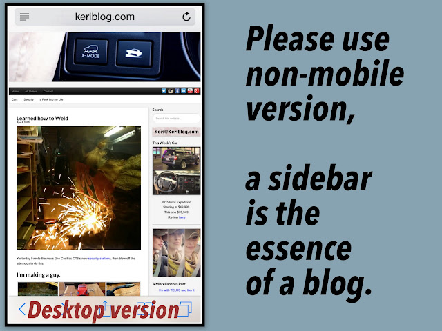
What do I always say – a sidebar is the essence of a blog – and now it’s gone. Despite this blog’s content being bright and cheerful, it looks opposite. Go search for something and get depressed too. And because mobile is quickly overtaking laptop, this paragraph was typed with my head hanging all low and sad.
It’s because I never once set a featured image for a post, all 2,000 posts, so no way can I fix this.
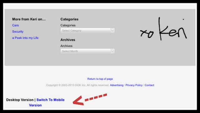
So please scroll to the bottom of my blog
and choose “Switch to Desktop Version”
Then instead of looking like the “Before” picture, it will look like this:
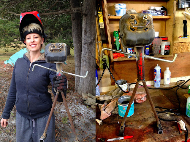
Original post: Learned how to Weld
